As a university, we’ve had two major issues related to the use of the campus learning management system.
- Sharing of personal information with third party services/companies1
- Copyright of materials uploaded to courses, and subsequently downloaded and shared with third parties as per above. Copyright compliance is a pretty big deal at Canadian universities.
We needed a way to provide a reminder of university policies, to provide guidance about what is allowed and not allowed, and to document that people have acknowledged these.
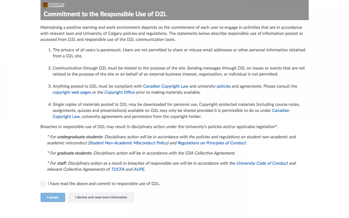
Brightspace has a relatively new “Terms and Conditions” tool, which provides an End User License Agreement style modal page with content after people log in - but before they advance to the main Brightspace interface. In our case, people will be coming from a single sign-on tool (CAS for main campus users and Destiny One for Cont Ed users). After they log in, they’ll be presented with something similar to this:

The initial text content of the Responsible Use statement, with some branding header stuff added for good measure
If they click the “I have read…” checkbox and then “I accept” 2, they get taken to the main Brightspace homepage and they don’t see the T&C statement again 3. If they click “I decline…”, they go to a page with more info. Either way, there’s an audit trail so the university can reach out with support if needed.
The statement has gone through relevant committees for revision, and is ready to go live on Monday.
Some tips, from our implementation:
- Implement first on a test environment, not in production. Obviously. This is a tool that inserts a modal agreement page before people get access to Brightspace, so it needs to be configured correctly the first time to prevent issues for, say, 40,000 people who suddenly see this. Implement on Test, iterate a bunch, and get it right before moving to Production. It’s best to annoy the small subset of people who are exploring Test rather than everyone on Production. (because everyone on Test will have to re-re-re-agree to the T&C every time there’s an edit. Sorry, Izzy.)
- Edit the content outside of Brightspace. Just In Case™. I never fully trust WYSIWYG editors. They have a way of helpfully “fixing” html. It’s best to write higher profile content outside of the editor so you have control over it - and have a full backup that’s easy to copy/paste into the HTML view of the Brightspace content editor.
- Editing the content of the Terms and Conditions tool triggers a reset - all people will need to re-agree to the statement if the content is edited. So, get it right the first time. Even fixing a typo or grammatical error will trigger the reset. Test it a bunch on the test environment first. I’ve been running versions of it there for a few months now, as we gave demos to various groups on campus to include them in the revision process and prepare their units for the change.
- Change the wording of the buttons through the Language Management tool. It’s under the “Terms and Conditions” tool, under “Page”. We changed the text of the checkbox, as well as the text of both buttons, after feedback from committees and people who are in front line support roles.
- Apply some branding to the page. By default, the tool provides a stark white page with the text. People will think that seems odd - has the site been hacked? is this a phishing attempt? Adding a logo can help. BUT. The content editor for the tool doesn’t allow uploads. And content within Brightspace requires a successful login to view. When the Terms and Conditions page is presented, people are in the nether space between not-logged-in and successfully-logged-in, so images and other resources need to be hosted outside of Brightspace 4 - and, it needs to be on a server that runs SSL so the content is served via HTTPS. For our page, I just borrowed the live UCalgary logo (in .svg format), via HTTPS. And am crossing my fingers that the URL for that image doesn’t change because if I have to edit the T&C content it forces the reset and everyone gets to re-agree to the statement. Which is not optimal.
- Instead of the “Decline - I need more info” button just logging people out, we set it to take them to a page on the Provost’s website with a copy of the statement and links to get more info.
Anyway. I get to throw the switch on Monday. Bracing for… “enthusiastic” feedback emails from the community shortly afterward.
Update: Almost forgot - the plugin that runs the T&C tool needs to be activated by D2L, as well as some configuration of the login workflow. There are some bits that need to be set that aren’t visible to System Administrators - only to the super-secret D2L role.
Update 2: After a week, 11,000 people have had the “responsible use” statement displayed. All but 3 clicked “Agree” - so, either it’s not a problem, or people are doing the EULA scroll/click shuffle…
-
homework sharing sites especially - recruiting our students to essentially copy the classlist for their courses and use that to let the company recruit students. which is a rather huge violation of privacy and the acceptable use of electronic communication policy that everyone is bound by as part of gaining access to university resources like email and Brightspace and others ↩︎
-
not sure why the tool is designed to have this level of failsafe - we’re not launching missiles or anything… ↩︎
-
until we reset it - likely once per year - or until we have to change the content and it resets automatically ↩︎
-
there might be a way to do it through the LOR, but I didn’t spend much time trying to get that going ↩︎