Justin posted a thing on listedtech, looking at historical “big booth” presenter data from the EDUCAUSE annual conference, with data from 2012-20221. It’s an interesting approach, but the charts he used didn’t make it easy to see if there was anything going on. Any trends? Shifts? Gaps? So, I took a couple of minutes to throw the data into Numbers and created the 2 visualizations I was looking for in the article. I didn’t adjust the categories from the article - how is conferencing different from conferencing/email? How is mobile different from mobile or networking? security vs. consulting? etc…
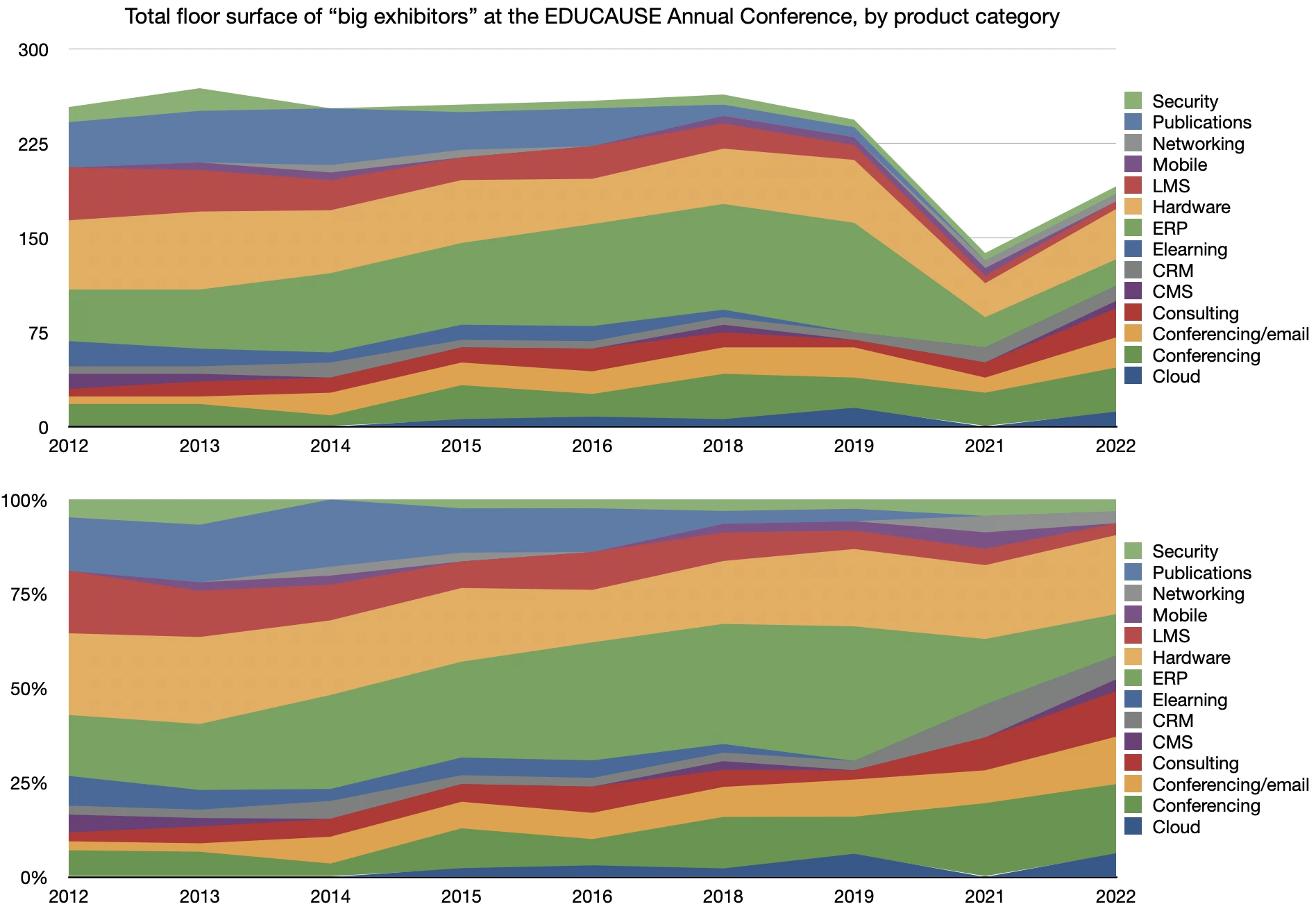
The first one is a stacked line chart of all categories for each year, making it easier to see an overall picture and to see if there are changes in total booth space that might explain some of the numbers.
The second one is a stacked 100% line chart, making it easier to see the relative composition of each category in each year of the the conference.
“ERP” starts to trail off in 2019 and doesn’t come back. “Publications” fades out around 2018 (but does it become LMS or elearning?). “Hardware” looks like the most stable category, and “Conferencing” started increasing in 2021 for some reason…
Still not ideal, as there are only so many colours you can use in things like this and there are a lot of categories. But, they give a better overview of the data.
Anyway. I have no skin in the game, but infovis design is important and can either help clarify the story that the data are telling, or obscure it.
It looks like there was no data for 2017 and 2020. Assuming the conference skipped those years. I can guess why there wasn’t one in 2020. No idea why 2017 was skipped, though… ↩︎