
I’ve been running this site on Hugo for several years now, and for most of that time I used other people’s themes and tweaked things around the edges. A few months ago, I decided to build my own theme from scratch with Claude Code. The theme is called Typeset.
Why build a custom theme?
The short answer: I got tired of fighting someone else’s decisions. Every borrowed theme comes with assumptions about what a blog is and what it should look like. Eventually those assumptions start getting in the way.
The longer answer: I wanted to actually understand my own site. 24 years of content across eight different content types, and I wanted layouts, CSS, and templates that I understood well enough to fix when something broke. Building it myself - even with Claude doing the heavy lifting on actual code - meant I had to understand every decision. And it gave me the flexibility to try new ideas - like the new “Series” feature I implemented this week (using Hugo’s flexible taxonomies and some partials and layouts).
I’d built a simpler theme almost exactly a year ago - and it mostly worked well, but I could never get it to fully do what I had in mind and the workflow was not great (using the Claude web application to build files that I downloaded and edited into place). So I decided to start over and build a full(er) Hugo theme from scratch using Claude Code.
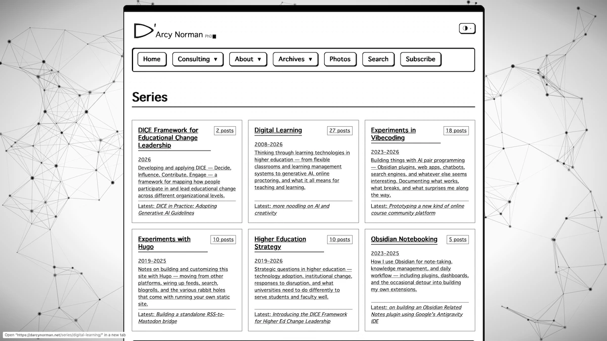
The Series page
Screenshot of the Series page, in 1bit css theme
Image by D'Arcy Norman
Why ’typeset'?
It started with a goal of building a theme that felt like a properly designed and highly readable website with good typography and layout. Most of the CSS themes (see below) currently use Helvetica because I like the feel of it (and my dissertation was set in Helvetica, despite the objections of my PhD supervisor, so I guess I’m committing to the bit).
CSS themes
The most visible feature (that most people probably won’t see) of Typeset is the theme switcher in the header. There are seven selectable colour themes plus a boid/flocking animation overlay for the terminally whimsical1:
- Light - clean and minimal (auto toggle based on browser display mode)
- Dark - dark grey with cool blue accents (auto toggle based on browser display mode)
- Terminal - amber text on near-black, Departure Mono font, subtle CRT scanline effect
- Mid-Century - warm tan and caramel tones, a nod to 1950s design
- 1-Bit - pure black and white, ChicagoFLF font, thick borders - basically a Mac SE in 1987
- Foothills - sky blue and earthy brown, inspired by a photo of the Alberta landscape I spend a lot of time looking at (but mostly to test my CSS Colour Themer utility’s ability to create colour palettes)
- 1975 - midnight navy with newsprint white content panels and NASA-worm red accents; OMNI magazine vibes
If you’ve selected a theme, your choice persists across visits via localStorage. If you haven’t picked one, the site respects your OS-level prefers-color-scheme setting and defaults to light or dark accordingly. I’ll probably continue to add and remove themes to try stuff out.
Each theme is a separate CSS file with all colours and fonts scoped to html[data-theme="..."] attributes. The main stylesheet defines a shared token system - spacing, type scale, container widths - that all themes inherit. The theme-specific files only override what they need to.
One thing that took more work than expected: preventing a flash of the wrong colours on page load (FOUC). The site uses an inline script in the document <head> that reads localStorage and sets the data-theme attribute synchronously, before the browser paints anything. There’s also a small block of critical CSS inlined in the base template as a fallback. It mostly works.
Content types
This site has always had more than just “blog posts.” Typeset has dedicated templates for eight content types:
- Posts - long-form writing, what you’re reading now
- Notes - short microblog-style observations (mostly used during my MSc and PhD programs)
- Asides - link posts and quick reactions
- Photos - images with captions, presented in a CSS grid
- Reflections - weekly journals: work, links, watching, reading
- Podcast - episode pages with embedded audio
- Pages - static content (about, blogroll, etc.)
- Consulting - professional services, deliberately minimal
Each type has its own archetype template so hugo new notes/my-note.md gives you the right front matter pre-filled. The section pages use different list layouts - photos get a grid, notes and asides get year-grouped lists, posts get paginated cards.
Obsidian as CMS application
My writing workflow lives in Obsidian. I open my website’s content directory as a Vault in Obsidian, and just use built-in Obsidian tools (templates, plugins, etc.) to manage content. I draft posts there, using note templates I’ve built up over time. The content/templates/ directory holds those Obsidian templates; it’s mounted but explicitly excluded from the Hugo build so the templates never end up as published pages. It’s a small thing, but it means my publishing tool and my writing tool share the same file tree without stepping on each other.
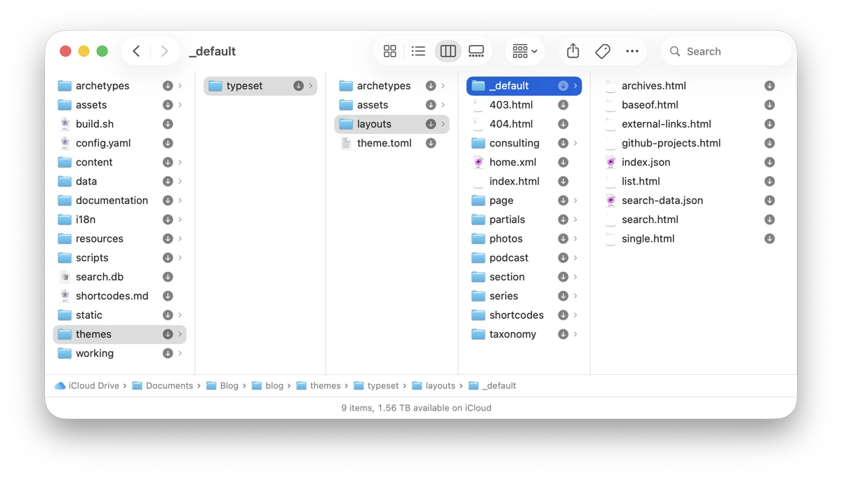
The typeset theme files
Screenshot of a macOS Finder window showing the theme file structure.
Image by D'Arcy Norman
Server-side integrations
Hugo generates static HTML, but this site has a few pieces that require a real server:
Search - Earlier in the site’s history, search used a JavaScript solution that downloaded a JSON index of all content and ran queries in your browser. That was fine until the index grew to 7–8MB and started taking several seconds to load before you could search anything. The current search is a SQLite database built at deploy time from Hugo’s JSON output, with a PHP API endpoint serving queries. I wrote about how that was built last year. (Source code available on GitHub)
Comments - A custom PHP comment system with SQLite storage. (Source code available on GitHub)
Bookmarks - A PHP bookmark management system, also server-side. (Source code available on GitHub)
Mastodon - After each deploy, a shell script posts new content to my Mastodon account at @dnorman@cosocial.ca. (Source code available on GitHub)
How it was built
Claude Code did most of the actual coding. I drove the design decisions - what content types to support, how indices should work, what the theme switcher should feel like, which of the eight themes to include, how I wanted menus and layouts to work - and Claude translated those into working Hugo templates and CSS. The process was iterative and often involved me explaining what was wrong with the output and asking for adjustments.
Is it “vibecoding”? Sort of. I had to understand enough Hugo’s templating system and CSS custom properties to have useful conversations about what I wanted. Claude can’t read my design ideas out of thin air. But I wouldn’t have shipped this without it - the amount of template code involved would have taken months on my own.
I hadn’t planned to share the source code, given how custom this theme is. But maybe parts of it could be handy? Anyway: Source code is available on GitHub.
one of the themes has something of an easter egg that adds to the boids/flocking/connections background… ↩︎